Four years ago the Panthers unveiled their new logo and sweaters as part of their rebranding initiative.
At the time, management felt the organization was trending up and would be a contender soon. This was a new era, and evolution in the franchise, and they felt they reached some kind of “maturity” and wanted a look that encompassed that. The idea was that when they achieved the highest mark (Stanley Cup), the new logo would be the one atop the hockey world.
While I like the military connection, and the idea behind the logo and what it represents, it just doesn’t aesthetically compare to the leaping cat for me.
There was a lot of speculation and excitement that built up as the unveiling got closer. One of the cool things about modern times is that you can get little teasers through leaks (if you’re into peeking) or see people’s own concepts they create and share.
I recall the day of the reveal going something like this (take it with a grain of salt since it’s been a few years):
There was the standard build up with Goldy hyping the crowd. He introduces the suits and then guides the discussion revolving around the idea/inspiration, where they see the Panthers going, etc.
After that, they unveil the design with players walking in decked out in the new threads.
Crowd reaction: Ehh...mixed.
I really didn’t like them at all and it didn’t take long for the comparisons to a European soccer team to start coming in.
I remember a number of fans voicing their displeasure with the design during the Q&A portion of the event and leadership - specifically John Viola (who was key in the design) - getting noticeably defensive.
But what could fans do? The design wasn’t going to change, and so we moved forward, and here we are four years later with the new (now normal) look Panthers.
I’ve accepted the look at this point and don’t dislike it as much as I initially did, but, again, the logo doesn’t compare to the original in my mind.
After removing the beloved leaping cat as the main stay on the jersey, management gave us a glimpse of it by keeping it as the helmet decal - though a revised/altered version of it.
Better than nothing, but still not the same thing.
Then it was announced last year that the great palm tree and stick shoulder patch would be coming back in the form of the new helmet decal.
Awesome. That’s one of my all-time favorite shoulder patch designs - right up there with Chicago’s tomahawks.
The addition of the palm tree/stick to the helmet effectively pushed the 2016 leaping cat version out of the picture and it no longer appears anywhere on Florida’s setup.
Here’s what’s odd...
I own some merchandise with the OG leaping cat on it, but am always looking to scoop up more. I think majority of fans love it.
Yesterday I felt like doing a little online shopping for some retro Cats gear - getting pretty pumped at the thought of the season potentially returning, so I started surfing and visited the “vintage” section for the Panthers at the below four sites:
NHL
Fanatics
Fansedge
Lids
Now, Fanatics/Fansedge are the merch providers for the NHL, so those three shops are all pretty much identical. Lids carriers similar stuff to all three, too.
But what’s odd is that the “vintage” merchandise isn’t vintage at all. You won’t find the leaping cat (original or 2016 version) on anything. Nor anything with the palm tree and stick.
In fact, all the items have the new logo on them and are either distressed to make them look retro, or have a vintage design concept. See the below example:
I turned my sights to the 47Brand site and saw the following “vintage” items. Not the original, but, instead, the newer “smoother” version.
Closer, but not good enough...
What’s even weirder is that with so many teams embracing their histories, Florida, who is currently replaying key ‘90s games for the franchise, wouldn’t want to capitalize on the moment and produce some gear.
This got me thinking...
There has no doubt been some grief around the rebrand, with many fans wanting to see the cat come back. The front office is seemingly wanting them to accept the new design and move on - at least that’s what it has kind of felt like to me.
Could the removal of the original cat, then the 2016 helmet decal, combined with what seems like a stoppage of merchandise with original/revised cat logos, be a way that the new ownership has slowly put their stamp on the franchise? The “out with the old, in with the new” routine.
I think there’s an element of new ownership trying to remove the “dark days” of complacency, questionable trades, lackluster and uninspired play. Which I understand. Maybe they felt that logo was associated with losing and they were looking for the clean slate.
It’s kind of a shame though, because I believe the leaping cat is an important part of the history and that it goes beyond ownership. Especially since there was some fantastic years in the ‘90s, and a lot of fans adhere and associate with that history.
Hey, for all I know, there could be something with the licensing/copy right of the original logo. I’m just jotting down some thoughts on a Tuesday evening.
For folks who go to games regularly, is there currently anything in the BB&T shop with the old leaping cat this season?
Everything Changes, Sports Are No Exception
The only constant is change. That’s true in life and sports. Every team has changed their look throughout the years, some more dramatically then other, but I feel like they usually come back around to that look that gave them their identity (even if it’s a slightly modified version).
It’s funny because I’m getting to this part of the blog and realizing this was probably a completely pointless entry.
I think what I was trying to say is that while change is a good thing, preserving the past and a team’s roots is also important.
As I said before, I’ve come around to the new look, but I’d be willing to bet the majority of fans want to see a return to the old in some capacity.
If the front office is interested in keeping that history alive, it would be great to see it happen if/when Florida gets a third jersey. That could be the perfect way achieve it, and, realistically, the last hope for awhile, because we know the new look is here to stay.
Ideally, I’d love to see it come back as the main logo and shift the palm tree/stick back as the shoulder patch. Then make the current logo a helmet decal. It could look sharp on a bucket.
What are your guy’s thoughts on the current sweaters and what would you like to see in a third? Are there any non-leaping cat fans here?
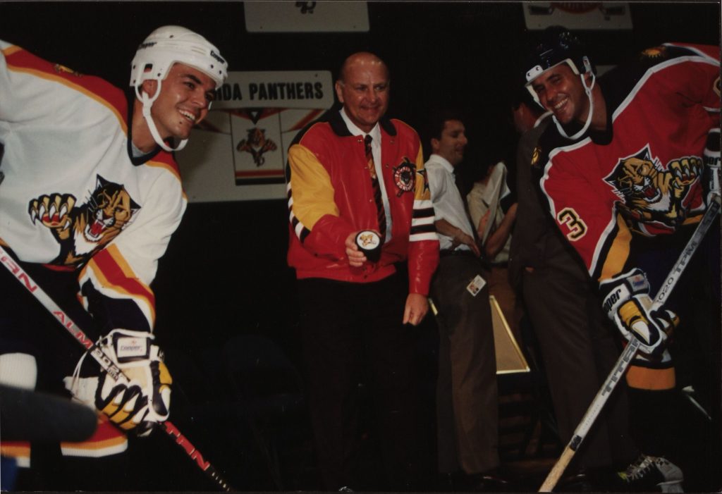
Panthers jersey unveiling in 1993 (photo courtesy of Florida Panthers Vault website)
How about those gloves in the above picture meant to look like paws and claws? They should bust those bad boys out again. Haha. Take a closer look here.
_________


 Join the Discussion:
»
Join the Discussion:
»