dbot
Vancouver Canucks |
|
 |
Location: Auckland -Burn it all down
Joined: 10.22.2008
|
|
|
|
I think the Canucks will put in a gutsy effort tonight led by JT Miller EP and Toffoli. I think we will see them start on time and I'm going with 4-2.
With Demko and the early goals reminds me a bit of where Marky was 2 years ago with the tough goal. I hope Demko has had some time with Ian Clark and we will be able to see the improvement. I am still happy they are there in the fight and am looking forward to the stretch drive.
- Nucknab23
From what i've read, Demko seems like a cool cucumber.
I'm hoping he brushes off the losing streak and has a solid game tonight.
If Hughes is out, we are in (even more) trouble. |
|
Marwood
Vancouver Canucks |
|
 |
Location: Cumberland, BC
Joined: 03.18.2010
|
|
|
|
This is the correct take. Dumb names get dumb logos
We accept most team names as normal because of how long they've been around, but if an expansion team today was named the Canucks, it'd be ridiculed 
- WhiteLie
Toronto is named after a freaking leaf.
I like the name Canuck. |
|
neem55
Vancouver Canucks |
|
Joined: 02.02.2012
|
|
|
|
|
Cap is going up between 2.5-6 mil. Little more wiggle room, i still expect a buyout and/or trade to offload a contract this summer |
|
bloatedmosquito
Vancouver Canucks |
|
 |
Location: A dose of reality in this cesspool of glee
Joined: 10.22.2011
|
|
|
|
I can see that
- VANTEL
Funny, but you have to admit, a picture is worth a thousand words.
 |
|
|
|
|
|
This is the correct take. Dumb names get dumb logos
We accept most team names as normal because of how long they've been around, but if an expansion team today was named the Canucks, it'd be ridiculed 
- WhiteLie
With our 50 year history we should be called the Woolnots. Now that would be a fun logo to design. |
|
|
|
|
LeftCoaster
San Jose Sharks |
|
 |
Location: Shark City, CA
Joined: 07.03.2009
|
|
|
|
It stands for Orca Bay, the group who owned the team before aqua-brothers. It's a corporate logo and nothing more. 
- bloatedmosquito
This is so wrong I'm going to challenge you on it 
The name Orca Bay Sports and Entertainment was born from the location of the team, the Pacific Northwest, obviously. Both the name of the former holding company and the crest represent our area, they are not mutually exclusive.
I'm in the don't give a rats ass on the Orca, take it or leave it, however, much like the blue and green for the ocean and the forest the Orca represents our location.
The modified Stick in Rink should be their primary logo with the current color scheme. WTF does the skate represent? It's as stupid as the name "Canucks", it's dumb and boring and in no way represents our location or the Canuck brand. |
|
|
|
|
|
|
Corey Pronman
@coreypronman
·
2m
Free agent season has begun. Christiansen was my # 14 ranked prospect free agent
Columbus just signed a college guy |
|
WhiteLie
Referee
|
|
 |
Location: When youre 7 pages behind Dont bother catching up, you will never get that time back - Codes1087
Joined: 07.26.2010
|
|
|
|
Toronto is named after a freaking leaf.
I like the name Canuck.
- Marwood
Dumb name, dumb logo  |
|
LordHumungous
Vancouver Canucks |
|
 |
Location: Greetings from the Humungous. Ayatollah of rock and rolla!
Joined: 08.15.2014
|
|
|
|
Look at this horrendous piece of poop. Talk about soulless.
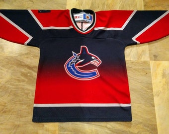
- bloatedmosquito
Absolutely Horrendous was a laughing stock amongst the league.
Dark Times.  |
|
1970vintage
Seattle Kraken |
|
 |
Location: BC
Joined: 11.11.2010
|
|
|
|
|
Thanks Carol!
2-1 Canucks
Also, while the orca might be a “corporate” representation of the former ownership group, it is also represents important imagery for the Pacific Northwest. I’m fine with it if they are, what does this arm chair GM know about uniforms anyway. |
|
LordHumungous
Vancouver Canucks |
|
 |
Location: Greetings from the Humungous. Ayatollah of rock and rolla!
Joined: 08.15.2014
|
|
|
|
|
|
|
Absolutely Horrendous was a laughing stock amongst the league.
Dark Times. 
- LordHumungous
When Canucks entered the league I lived in Montreal and I remember thinking as a 15 year old what ugly jerseys. When the flying V and the skate cam when I lived in Edmonton wondering if Vancouver had a patent on ugly jerseys just like ugly Xmas sweaters. |
|
LordHumungous
Vancouver Canucks |
|
 |
Location: Greetings from the Humungous. Ayatollah of rock and rolla!
Joined: 08.15.2014
|
|
|
|
This is the correct take. Dumb names get dumb logos
We accept most team names as normal because of how long they've been around, but if an expansion team today was named the Canucks, it'd be ridiculed 
- WhiteLie
Not as dumb as the "kraken' lol
Canucks is a solid name in any era. |
|
Marwood
Vancouver Canucks |
|
 |
Location: Cumberland, BC
Joined: 03.18.2010
|
|
|
|
Dumb name, dumb logo 
- WhiteLie
Johnny Canuck (occasionally also “Jack Canuck” or “Young Canuck”) came to serve as the recognized Canadian equivalent of Uncle Sam in the United States or John Bull in Great Britain: a fictional male figure who personifies the nation as a whole. All three of these figures are patriotic, assertive and proud; they accept insults from no one. |
|
Marwood
Vancouver Canucks |
|
 |
Location: Cumberland, BC
Joined: 03.18.2010
|
|
|
|
Thanks Carol!
2-1 Canucks
Also, while the orca might be a “corporate” representation of the former ownership group, it is also represents important imagery for the Pacific Northwest. I’m fine with it if they are, what does this arm chair GM know about uniforms anyway.
- 1970vintage
Nothing. |
|
1970vintage
Seattle Kraken |
|
 |
Location: BC
Joined: 11.11.2010
|
|
|
|
Absolutely Horrendous was a laughing stock amongst the league.
Dark Times. 
- LordHumungous
This was worse!
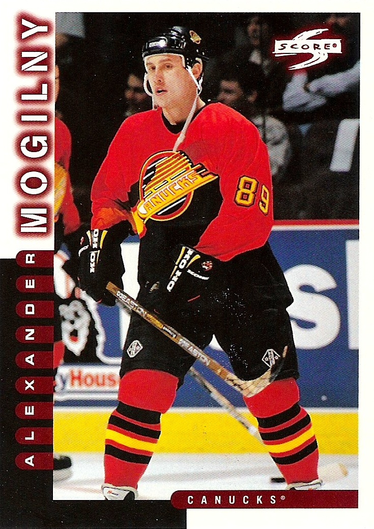 |
|
WhiteLie
Referee
|
|
 |
Location: When youre 7 pages behind Dont bother catching up, you will never get that time back - Codes1087
Joined: 07.26.2010
|
|
|
|
Not as dumb as the "kraken' lol
Canucks is a solid name in any era.
- LordHumungous
Oof the Kraken would be among the worst names in the league.
I'm fine with the Canucks, as its been the name all my life, but critically speaking its a fairly meaningless and unidentifiable name particularly for the region. To expect a logo to capture "Canuck" and the region is next to impossible |
|
bloatedmosquito
Vancouver Canucks |
|
 |
Location: A dose of reality in this cesspool of glee
Joined: 10.22.2011
|
|
|
|
This is so wrong I'm going to challenge you on it 
The name Orca Bay Sports and Entertainment was born from the location of the team, the Pacific Northwest, obviously. Both the name of the former holding company and the crest represent our area, they are not mutually exclusive.
I'm in the don't give a rats ass on the Orca, take it or leave it, however, much like the blue and green for the ocean and the forest the Orca represents our location.
The modified Stick in Rink should be their primary logo with the current color scheme. WTF does the skate represent? It's as stupid as the name "Canucks", it's dumb and boring and in no way represents our location or the Canuck brand.
- LeftCoaster
 awesome.
The orca? Why does it represent BC? It's not exclusive to this region. It's just as common the world over.
It wasn't overly revered in our First Nation traditions (salmon, raven, eagle, beaver, clam, sea otter hold much more importance).
We used to hunt them as pests and then capture a few for study/entertainment. They interfered in what many people saw as far more important... commercial and recreational fishing.
Orca conservation and understanding is a very recent phenomenon. 60 years tops. Close to the amount of time the canucks have been in existence.
So the argument about it representing our region is weak sauce. It's a corporate logo thinly disguised as a proud symbol of our people.  |
|
Retinalz
Vancouver Canucks |
|
 |
Location: Vancouver, BC
Joined: 01.31.2015
|
|
|
|
VANTEL
Vancouver Canucks
Location: The call me Senor Snake Sausage
Joined: 07.03.2010
Today @ 3:37 PM ET
/Cam Robinson/
@Hockey_Robinson
#Canucks prospect, Arvid Costmar had two primary assists this morning - on the tying goal and OT winner.
He's up to 50 points in 29 SuperElit games - 4th in league scoring. His 1.72 points-per-game lead the pack.
Hopefully he graduates to the SHL next season and then comes over for the AHL after that  |
|
|
|
|
|
Oof the Kraken would be among the worst names in the league.
I'm fine with the Canucks, as its been the name all my life, but critically speaking its a fairly meaningless and unidentifiable name particularly for the region. To expect a logo to capture "Canuck" and the region is next to impossible
- WhiteLie
Krackens logo could be good
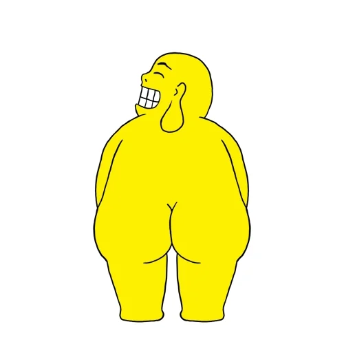 |
|
Retinalz
Vancouver Canucks |
|
 |
Location: Vancouver, BC
Joined: 01.31.2015
|
|
|
|
|
Vancouver Canucks is no different than Montreal Canadiens. |
|
dbot
Vancouver Canucks |
|
 |
Location: Auckland -Burn it all down
Joined: 10.22.2008
|
|
|
|
This was worse!

- 1970vintage
yeesh.  |
|
|
|
|
|
Vancouver Canucks is no different than Montreal Canadiens.
- Retinalz
Except they have nice jerseys and a few more cups |
|
LeftCoaster
San Jose Sharks |
|
 |
Location: Shark City, CA
Joined: 07.03.2009
|
|
|
|
 awesome. awesome.
The orca? Why does it represent BC? It's not exclusive to this region. It's just as common the world over.
It wasn't overly revered in our First Nation traditions (salmon, raven, eagle, beaver, clam, sea otter hold much more importance).
We used to hunt them as pests and then capture a few for study/entertainment. They interfered in what many people saw as far more important... commercial and recreational fishing.
Orca conservation and understanding is a very recent phenomenon. 60 years tops. Close to the amount of time the canucks have been in existence.
So the argument about it representing our region is weak sauce. It's a corporate logo thinly disguised as a proud symbol of our people. 
- bloatedmosquito
You just don't get it, I feel like I'm talking to Vantel 
Of all the teams in the National Hockey League it is pretty exclusive to our area, if the NHL was a world sport like football (aka soccer) then I'd be inclined to agree with you, however, its not!
Much like the Winged Wheel as the Red Wings crest it represents their history and their past with the automaker industry. The Orca represents our area, not our "people" as you've stated above. |
|