|
|
|
LordHumungous
Vancouver Canucks |
|
 |
Location: Greetings from the Humungous. Ayatollah of rock and rolla!
Joined: 08.15.2014
|
|
|
NorthNuck
Vancouver Canucks |
|
 |
Location: Yellowknife, NWT
Joined: 05.30.2016
|
|
|
|
|
Thanks Carol, every divisional game is huge now. Need to put the losses to Eastern teams in the rearview and get it done. |
|
NorthNuck
Vancouver Canucks |
|
 |
Location: Yellowknife, NWT
Joined: 05.30.2016
|
|
|
|
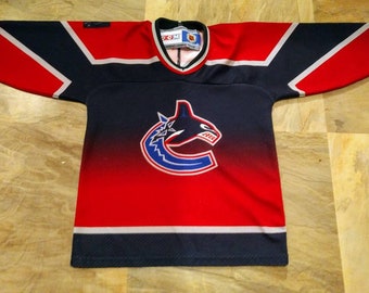
It stands for Orca Bay, the group who owned the team before aqua-brothers. It's a corporate logo and nothing more. 
- bloatedmosquito
I get that, but I don't really see the problem. It's pretty emblematic of the coast, the logo doesn't look bad to me. Plus killer whales are cool, I don't really see a reason to change it. |
|
Codes1087
Vancouver Canucks |
|
 |
Joined: 09.24.2014
|
|
|
|
I get that, but I don't really see the problem. It's pretty emblematic of the coast, the logo doesn't look bad to me. Plus killer whales are cool, I don't really see a reason to change it.
- NorthNuck
its just a preference thing. It was a corporate logo when introduced and now that they don't have any involvement, I would absolutely love for them to go back to the stink in the rink logo (its always been my personal favorite, along with the color scheme). |
|
LordHumungous
Vancouver Canucks |
|
 |
Location: Greetings from the Humungous. Ayatollah of rock and rolla!
Joined: 08.15.2014
|
|
|
|
I get that, but I don't really see the problem. It's pretty emblematic of the coast, the logo doesn't look bad to me. Plus killer whales are cool, I don't really see a reason to change it.
- NorthNuck
It's bad. |
|
dbot
Vancouver Canucks |
|
 |
Location: Auckland -Burn it all down
Joined: 10.22.2008
|
|
|
|
3-2 Vancouver.
JV, EP and TP with the empty netter.  |
|
LordHumungous
Vancouver Canucks |
|
 |
Location: Greetings from the Humungous. Ayatollah of rock and rolla!
Joined: 08.15.2014
|
|
|
|
its just a preference thing. It was a corporate logo when introduced and now that they don't have any involvement, I would absolutely love for them to go back to the stink in the rink logo (its always been my personal favorite, along with the color scheme).
- Codes1087
 |
|
|
|
|
|
I get that, but I don't really see the problem. It's pretty emblematic of the coast, the logo doesn't look bad to me. Plus killer whales are cool, I don't really see a reason to change it.
- NorthNuck
Orca's are good for Vancouver tourism but has little to do with the hockey story other than the previous owner selling his brand. |
|
dbot
Vancouver Canucks |
|
 |
Location: Auckland -Burn it all down
Joined: 10.22.2008
|
|
|
|
its just a preference thing. It was a corporate logo when introduced and now that they don't have any involvement, I would absolutely love for them to go back to the stink in the rink logo (its always been my personal favorite, along with the color scheme).
- Codes1087
i prefer the blue/green colour scheme too, but have a soft spot for the flying skate. |
|
bloatedmosquito
Vancouver Canucks |
|
 |
Location: A dose of reality in this cesspool of glee
Joined: 10.22.2011
|
|
|
|

- LordHumungous
Look at this horrendous piece of poop. Talk about soulless.
 |
|
|
|
|
|
|
Canucks is such a stupid name so it is hard to have hockey theme about something so general. |
|
|
|
|
|
Look at this horrendous piece of poop. Talk about soulless.

- bloatedmosquito
I have never liked any of their jerseys when they first come out. That includes skate , flying V stick in rink. |
|
NorthNuck
Vancouver Canucks |
|
 |
Location: Yellowknife, NWT
Joined: 05.30.2016
|
|
|
|
its just a preference thing. It was a corporate logo when introduced and now that they don't have any involvement, I would absolutely love for them to go back to the stink in the rink logo (its always been my personal favorite, along with the color scheme).
- Codes1087
Oof, the stick in rink is so boring and generic, I know I would never buy a jersey with that on it. I'd like the team to have more personality than that. |
|
|
|
|
|
|
I read on Twitter before forget exactly where but they said Hughes will play. |
|
NorthNuck
Vancouver Canucks |
|
 |
Location: Yellowknife, NWT
Joined: 05.30.2016
|
|
|
|
i prefer the blue/green colour scheme too, but have a soft spot for the flying skate.
- dbot
The flying skate is the best jersey they've ever had, and it should be the alternate, but if they were going to change the primary I don't think I'd want it |
|
|
|
|
|
Oof, the stick in rink is so boring and generic, I know I would never buy a jersey with that on it. I'd like the team to have more personality than that.
- NorthNuck
 |
|
|
|
|
|
Oof, the stick in rink is so boring and generic, I know I would never buy a jersey with that on it. I'd like the team to have more personality than that.
- NorthNuck
Edler is the president of personality . VP would be Tanev and Stecher. Fuk this is a boring team   |
|
bloatedmosquito
Vancouver Canucks |
|
 |
Location: A dose of reality in this cesspool of glee
Joined: 10.22.2011
|
|
|
Marwood
Vancouver Canucks |
|
 |
Location: Cumberland, BC
Joined: 03.18.2010
|
|
|
|

The stick n rink is classic.
The orca sucks sqiud balls. |
|
|
|
|
|
|
/Cam Robinson/
@Hockey_Robinson
#Canucks prospect, Arvid Costmar had two primary assists this morning - on the tying goal and OT winner.
He's up to 50 points in 29 SuperElit games - 4th in league scoring. His 1.72 points-per-game lead the pack. |
|
Nucknab23
Vancouver Canucks |
|
Location: Calgary, AB
Joined: 01.13.2016
|
|
|
|
|
I think the Canucks will put in a gutsy effort tonight led by JT Miller EP and Toffoli. I think we will see them start on time and I'm going with 4-2.
With Demko and the early goals reminds me a bit of where Marky was 2 years ago with the tough goal. I hope Demko has had some time with Ian Clark and we will be able to see the improvement. I am still happy they are there in the fight and am looking forward to the stretch drive. |
|
|
|
|
WhiteLie
Referee
|
|
 |
Location: When youre 7 pages behind Dont bother catching up, you will never get that time back - Codes1087
Joined: 07.26.2010
|
|
|
|
Canucks is such a stupid name so it is hard to have hockey theme about something so general.
- VANTEL
This is the correct take. Dumb names get dumb logos
We accept most team names as normal because of how long they've been around, but if an expansion team today was named the Canucks, it'd be ridiculed  |
|
WhiteLie
Referee
|
|
 |
Location: When youre 7 pages behind Dont bother catching up, you will never get that time back - Codes1087
Joined: 07.26.2010
|
|
|
|
I have never liked any of their jerseys when they first come out. That includes skate , flying V stick in rink.
- VANTEL
The new third is by far their best in their colourful history  |
|