|
|
|
Pet.m.d.
|
|
Location: Buckeye, AZ
Joined: 06.29.2017
|
|
|
joshs
Buffalo Sabres |
|
Location: cheektowaga, NY
Joined: 07.07.2012
|
|
|
|
|
|
|
|
Amen! I'm 63 and have seen most of their up's and downs. This is exciting again. Really appreciated the last blog.... no one attacking anyone. Thanks stripes! Good read! |
|
BeadyEyedDouche
Buffalo Sabres |
|
 |
Location: Rustmine Ramsum most exciting Sabres klugdragger since Taro Tsujimoto
Joined: 07.01.2016
|
|
|
|
|
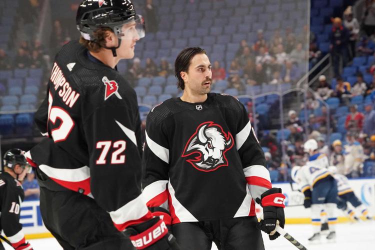
We should just go back to the goathead uniforms full-time |
|
SabreWest
Buffalo Sabres |
|
 |
Location: BC
Joined: 03.02.2015
|
|
|
|
|
I share Hank's sentiment 100%. I've been a fan since 74/75'. It's nice to see the Sabres relevant and fun again. |
|
joshs
Buffalo Sabres |
|
Location: cheektowaga, NY
Joined: 07.07.2012
|
|
|
|
Amen! I'm 63 and have seen most of their up's and downs. This is exciting again. Really appreciated the last blog.... no one attacking anyone. Thanks stripes! Good read!
- THENINELINE
Nice post. I agree it certainly is fun again. Such a blessing to have the bills as a dominant team and the Sabres on the up and up. |
|
Buff36
Buffalo Sabres |
|
Joined: 10.13.2019
|
|
|
|
|
Nice Read Hank!! Good times |
|
SABRES 89
Season Ticket Holder
Buffalo Sabres |
|
 |
Location: I'm very Happy to be here. Las Vegas Via Buffalo N.Y.
Joined: 02.17.2007
|
|
|
|
We should just go back to the goathead uniforms full-time
- BeadyEyedDouche
Yes we should |
|
Hatboro_Swords
Buffalo Sabres |
|
 |
Location: Next year is gonna be 05/06 all over again, PA
Joined: 07.30.2010
|
|
|
|
|
What a game to go to. Deja 05/06 all over again. |
|
|
|
|
|
Yes we should
- SABRES 89
A majority of season ticket holders would not like that
Personally I like seeing a mix of blue and gold with the black goat sprinkled in |
|
BeadyEyedDouche
Buffalo Sabres |
|
 |
Location: Rustmine Ramsum most exciting Sabres klugdragger since Taro Tsujimoto
Joined: 07.01.2016
|
|
|
|
A majority of season ticket holders would not like that
Personally I like seeing a mix of blue and gold with the black goat sprinkled in
- Sabretooth9
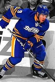
The current home/away set looks sterile and vapid. No shoulder patches, no pants logo, the striping on the pants is a solid yellow instead of having contrast with stripes, the holdover trim on the dark jersey stripes, the lack of a yellow collar, they took a classic uniform and made it boring and uninspired.
I’m sorry but the adidas goathead uniform is absolute perfection.
I will say it again, our 2008 Winter Classic uniform is our best look, all-time, with the adidas goathead a very close 2nd and our 40th anniversary pajamas are right behind them.

 |
|
BeadyEyedDouche
Buffalo Sabres |
|
 |
Location: Rustmine Ramsum most exciting Sabres klugdragger since Taro Tsujimoto
Joined: 07.01.2016
|
|
|
|
It’s not just the homer in me. I have put a lot of thought into this…
I really think the Buffalo Bills logo is the most beautiful sports logo of all-time.
It is visually stunning. It has perfect contrast. Just the right amount of detail. And the red stripe gives a sense of motion to the design that no other sports logo has managed to pull off.
There might be more classic and clever designs like the Hartford Whalers, there might be more recognizable logos like the New York Yankees, more iconic logos such as the Boston Bruins B-spoke… but there is none prettier than that leaping buffalo.
|
|
gordong
|
|
 |
Location: NY
Joined: 02.06.2007
|
|
|
|
We should just go back to the goathead uniforms full-time
- BeadyEyedDouche
Ummmm... No we should not blue and gold for life... |
|
|
|
|
|
|
Didn't have one of those moments but I have been starting to get excited about this team.
|
|
BeadyEyedDouche
Buffalo Sabres |
|
 |
Location: Rustmine Ramsum most exciting Sabres klugdragger since Taro Tsujimoto
Joined: 07.01.2016
|
|
|
|
Ummmm... No we should not blue and gold for life...
- gordong
So sick of calling yellow gold and the current shade of blue is too bright. The stripes are too thick and the whole set just looks like a bad version of our original uniforms.
We went from slug, to so-navy-it-might-as-well-be-black and back to “royal” blue. It’s a few shades too bright on both the yellow and blue.

vs.
/cdn.vox-cdn.com/uploads/chorus_asset/file/23209411/1362596329.jpg)
You see how much nicer that blue pops in the Mogilny picture? It’s subtle but it’s there, the yellow is also a shade darker. It drives me nuts. And all in the name of standardization of manufacturing techniques. |
|
Wetbandit1
Vegas Golden Knights |
|
 |
Location: Unpopular opinion (i think): The best Die Hard movie is the 4th one- Live free or Die Hard -jdfitz7, NY
Joined: 10.07.2010
|
|
|
|
It’s not just the homer in me. I have put a lot of thought into this…
I really think the Buffalo Bills logo is the most beautiful sports logo of all-time.

It is visually stunning. It has perfect contrast. Just the right amount of detail. And the red stripe gives a sense of motion to the design that no other sports logo has managed to pull off.
There might be more classic and clever designs like the Hartford Whalers, there might be more recognizable logos like the New York Yankees, more iconic logos such as the Boston Bruins B-spoke… but there is none prettier than that leaping buffalo.
- BeadyEyedDouche
Raise
|
|
Wetbandit1
Vegas Golden Knights |
|
 |
Location: Unpopular opinion (i think): The best Die Hard movie is the 4th one- Live free or Die Hard -jdfitz7, NY
Joined: 10.07.2010
|
|
|
|
So sick of calling yellow gold and the current shade of blue is too bright. The stripes are too thick and the whole set just looks like a bad version of our original uniforms.
We went from slug, to so-navy-it-might-as-well-be-black and back to “royal” blue. It’s a few shades too bright on both the yellow and blue.

vs.
/cdn.vox-cdn.com/uploads/chorus_asset/file/23209411/1362596329.jpg)
You see how much nicer that blue pops in the Mogilny picture? It’s subtle but it’s there, the yellow is also a shade darker. It drives me nuts. And all in the name of standardization of manufacturing techniques.
- BeadyEyedDouche
Having 5 different yellows is trashy
|
|
BeadyEyedDouche
Buffalo Sabres |
|
 |
Location: Rustmine Ramsum most exciting Sabres klugdragger since Taro Tsujimoto
Joined: 07.01.2016
|
|
|
|
Raise

- Wetbandit1
Wrong and they got sued so that’s not an official logo |
|
BeadyEyedDouche
Buffalo Sabres |
|
 |
Location: Rustmine Ramsum most exciting Sabres klugdragger since Taro Tsujimoto
Joined: 07.01.2016
|
|
|
|
Having 5 different yellows is trashy
- Wetbandit1
Manufacturing issues were more prevalent then, but I will raise you a “5 different yellows sucks” and point out that the Dallas Cowboys use about 36 shades of blue on their white uniforms and it looks excellent and iconic.
I will say this, though, the Cincinnati Bengals’ helmets are several shades darker of an orange than their uniforms and it looks putrid and it’s unacceptable.
Gloves are not part of the uniform in hockey, imo. They are protective gear. |
|
Buff36
Buffalo Sabres |
|
Joined: 10.13.2019
|
|
|
kingcong39
Buffalo Sabres |
|
Location: albany, NY
Joined: 02.21.2007
|
|
|
|
Hoping this is inaccurate...
ERIE COUNTY ACTION: the Niagara Action has learned from a source at the Buffalo Police Department that there is a significantly higher number of deceased individuals than what has been reported at this point. The specific quote from this officer was that “there are so many (1/3)
dead bodies, there isn’t enough room to store them.” The Erie County Medical Examiners Office has already released a statement through County Executive Mark Poloncarz that there are several unidentified "John Doe" and "Jane Doe" victims from the blizzard. If you believe a (2/3)
loved one could be among them, please contact your local law enforcement agency. Our thoughts and prayers continue to be with those affected by this tragedy (3/3).
https://twitter.com/Niaga...jID9u23NeFgWZ-lUU40w&s=19 |
|
lacaprup
Buffalo Sabres |
|
Location: NY
Joined: 07.23.2006
|
|
|
|
Hoping this is inaccurate...
ERIE COUNTY ACTION: the Niagara Action has learned from a source at the Buffalo Police Department that there is a significantly higher number of deceased individuals than what has been reported at this point. The specific quote from this officer was that “there are so many (1/3)
dead bodies, there isn’t enough room to store them.” The Erie County Medical Examiners Office has already released a statement through County Executive Mark Poloncarz that there are several unidentified "John Doe" and "Jane Doe" victims from the blizzard. If you believe a (2/3)
loved one could be among them, please contact your local law enforcement agency. Our thoughts and prayers continue to be with those affected by this tragedy (3/3).
https://twitter.com/Niaga...jID9u23NeFgWZ-lUU40w&s=19
- kingcong39
I'll check with a LEO I know. Sounds awful. |
|
Buff36
Buffalo Sabres |
|
Joined: 10.13.2019
|
|
|
|
Hoping this is inaccurate...
ERIE COUNTY ACTION: the Niagara Action has learned from a source at the Buffalo Police Department that there is a significantly higher number of deceased individuals than what has been reported at this point. The specific quote from this officer was that “there are so many (1/3)
dead bodies, there isn’t enough room to store them.” The Erie County Medical Examiners Office has already released a statement through County Executive Mark Poloncarz that there are several unidentified "John Doe" and "Jane Doe" victims from the blizzard. If you believe a (2/3)
loved one could be among them, please contact your local law enforcement agency. Our thoughts and prayers continue to be with those affected by this tragedy (3/3).
https://twitter.com/Niaga...jID9u23NeFgWZ-lUU40w&s=19
- kingcong39
There's a lot not being said, my Dad is a retired Buffalo Cop. I am not gonna say much about what he has told me. But this storm was DEVASTATING and I will leave it as that. |
|
Buff36
Buffalo Sabres |
|
Joined: 10.13.2019
|
|
|